THE CHECKLIST
Getting sent to corrections over minor design issues? This is the hub for all the need to know details of designing a suka and getting it pass those stinky design admin's expectations!
This area highlights stuff like marking visibility, gradient/color choices, common issues, and what freedoms users can take with their designs.
GOOD GRADIENT
Nuance gradients should be top to bottom over the suka, or bottom to top; not side to side.
They should not overtake more than 40% of the base layer, and should not heavily stray from the chosen swatch color. It MUST be fully blended, with no distinctive lines, shape, or placement.
You may:
-
Choose a gradient from "SWATCH"
-
Choose a gradient from "GRADIENT SLIDER"
-
Take your chosen swatch color, lower (or raise) its value no more than +/-10 pts.
-
For saturation, do not saturate/desaturate more than +/-5 pts.
-
For "hue shifts", do not shift into a different color entirely.
-
(i.e if my suka is tan, i should not put a full red or full yellow color gradient on them, but can shift around to a different tan, brown, or orange.
-


BAD GRADIENT
Poor blending, mimicked placements of other markings (like sable, etching, urajiro, etc) , and uneven contrast (too dark / too light) are grounds for a bad nuance gradient.
Make sure to use a large blending brush, or set your blur settings up to med/high! Gradient nuances should be very subtle, and are not meant to "create" markings on a suka.
Do Not:
-
Choose a gradient from a different swatch, of the same base color. (Grullo x Almond , Wheat x Beige, etc)
-
Choose a custom gradient color that too heavily interferes with your original swatch color. If your suka looks more colorful (or lacking more color) than it should, it can be sent to corrections.
-
Your safest choices are on the swatches and gradient sliders!


GOOD ✔
this would pass!

BORDERLINE!
on the edge of corrections

SAFE ✔
.looks okay, safe enough.

BAD ✘
try a different method!

lighter than
the base
"Lighter than the base" markings may be anything that appears lighter than the base color , visible enough for admins to see a difference between the base + marking.
The color may be slightly saturated or desaturated, but this usually means more vibrant/light/ or pale against the suka's base color
All the colors above are "lighter than the base" and would pass, none of the colors here are unsafe, due to their balanced saturations.

darker than
the base
"Darker than the base" markings are anything that appears darker than the base color, visible enough for admins to see a difference between the base + marking.
The color may be slightly saturated to stand out or desaturated to tone down the colors, but this usually means a more rich/dark color.
All the colors above are "darker than the base" and would pass (when used responsibly, in regards to saturated markings like the ears/above eyes)

relative to
the base
"Relative to the base" means the color is a "nearby neighbor" on the color wheel. The parent color here is "Rust" and it's brownish- a "relative" of brown would be orange, yellow, or red hues. Alternatively, pale or desaturated colors can be relatives too.
Tends to be a paler, lower contrast, black/near white/grey, or slightly color tinted markings (for colorful bases such as Blue, Gator, or Cognac...) Relative colors tend to fall in the borderline saturation/hue shift ranges (see above - gradients)

full
desaturation
Full desaturation (monochrome/grey only) marking colors can work on some coats, but do not always work in the same capcity on others.
You may use "grey" markings IF the contrast/value is offset well enough to make the markings visible against the base color (and all surrounding markings).
The Rust (left) side of the face looks fairly okay with all monochrome markings, they stand out, and look either lighter/darker than the base.
On the Champagne (right) side of the face, our greys are visible but don't look too great as they are around the eyebrows and under eyes. This would be an area of correction, even if all your other colors look just fine.

BLUE blonde
FAWNS
The trend of desaturated greys/slate grey blues on pale or blonde-like coats is common and you don't need a special gene to do it. However, the "blue" to your fawns should not be truly blue in hue but instead a silver, platinum, or slate-grey (mild) blue. This is a form of "relative to the base" coloring.
Heavy desaturated markings on very vibrant coat colors doesn't tend to work out well (see "full desaturation"), and colors like Blue, Rust, etc should have desaturated markings with a bit of color still in them.
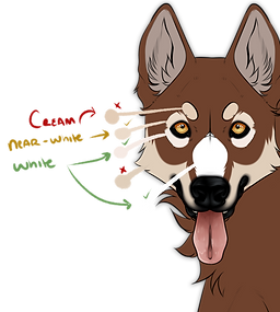
WHITE. NEAR WHITE.
CREAM???
White is typically above V:94, and appears bright/desaturated in comparison to the suka and can have pink flesh tones.
Near-White is for those oh so close to white tinted colors. The value shouldn't change, but the hue might shift to a warmer/colder hue.
Cream is for anything too "saturated" or darker than V:94. Sometimes cream looks white on darker/vibrant colors, that does not make cream , white.
However, white markings CAN have cream nuances in them, so long as the majority is unmistakably
white/near-white/pure white. This works best on large coverage white markings, like Piebald, Appaloosa, and Sabino.
Markings
that Touch
Markings that "touch" or "overlay" each other should always be distinct from one another. Our example, Jim, has Mask, Underbelly, and Collar. These 3 markings have the ability to overlap one another, how neat!
Markings should not be so similarly colored that they basically "disappear" into one another. Any admin or user, should be able to look at Jim, and see that he clearly has 3 markings.
Good Jim shows each marking in a different-enough color that he would pass design approvals.
corrections
What's the solution to Bad Jim's problems?
Well, there are a few solutions you will see in your corrections from admins, what specific solution they give may work better for your design, but let's look at all the possible solutions and try to fix it ourselves.
The next (4) image examples will walk you through contrast and visibility.
The last (2) image examples will show you alternatives and work-arounds to a visibility issue.

GOOD ✔
each marking is distinct from one another in color, we can tell all (3) markings apart.

BAD ✘
Bad Jim looks like he's just sporting a very extended Underbelly, it's not clear to everyone that he actually has 3 markings. We can barely tell the difference, it's almost looks like 1 big marking instead.

BAD ✘
Bad Jim came back to show you a poor representation of contrast, our underbelly is too close to our base color, which is another aspect that should remain visible.
You want to try and avoid a look like Bad Jim, he'll send you to corrections.

SOLUTION A
the easiest fix to a marking visibility issue is to either show more of a marking, or to make sure it is distinctly different in value, saturation, or hue when its atop another marking.

SOLUTION b
solution B is the "scenic route" of fixes, requiring you to extend markings into different areas of the design to help outline the marking and add to its visibility.
Now, it looks like Jim has maybe 3 markings, and that's borderline enough to pass most times! But again, we had to edit a lot to keep our color choices from before, when we could just edit the values instead.

SOLUTION c
not too hard of a fix, but if you have a very specific palette you're trying to stick to, you may not like solution C.
The easiest way to re-choose colors entirely, is to pick from the base color and raise/lower the value (~+/-10) to help you start seeing the contrast. From there, you can use a filter slider (Hue/Saturation/Value or Brightness/Contrast/Depth sliders) to very slightly tune the colors on your design so that your newly chosen colors are not too drastic from your originally submitted design

sAFE ✔

GOOD ✔

BAD ✘
With a few tweaks, our Underbelly looks less like Points, sometimes it's as easy as changing the color or marking placement. White freckles/ticking is commonly mistaken for Snow; Seal for Urajiro; and many others. Look at your design and ask yourself, could another user accurately point out all my markings? How many of your markings may be confused for another?
This may seem really tedious, why not just ban certain colors for certain markings? Well, that limits a lot more users, who are not trying to imitate markings, it's instead easier to just have users slightly alter colors or looks of the markings to more closely resemble what's seen in the guides.
MIMICKING MARKINGS
A common issue is "mimicking" other markings when you're not intending to. Turning Underbelly into a rich tan-gradient brown, is a great way to make it look like Points - don't do that!
Our solutions are either to remove the gradient, change the color, or change the actual shape/placement of our marking - and removing any "notable features" like the Points cheek/chest spots.

Safe ✔

GOOD ✔

BAD ✘
The safe example shows a clear marking, due to its defined edges and notions of details, it's not just a blob of color over our base layer. The good example shows a common style of erasing away fur details or interesting patterns, and then going back over the area with a blur tool or blur filter to make sure it remains soft.
*for reference, the "too soft" example would work perfect for something like Seal, Bloom, or Jay that needs to be entirely soft/blurred.
A softly expressed marking somewhere between "safe" and the "too soft" would also likely work, but then maybe considered borderline - that's a risk if you want to take it!
SOFTLY DEFINED MARKINGS
Softly defined markings should have some sort of edge, or defined placement (while remaining soft in expression, with an airbrush or blur tool)
Having trouble? Admins telling you it's not soft, too soft, or not well defined enough? They're referring to the distinction between base color + marking.

safe ✔

GOOD ✔

BAD ✘
Our good example takes the bad example and blends the colors fully, now it passes! We can even alter the saturation and value of markings to make it stand out a bit more, so long as we stick to the nuance gradient rules.
Dual/Two-toned markings can get tricky, they should always remain near one another, so it is somewhat clear that they belong to the same marking, and not for example crafted to look like a new marking entirely, which will get you sent to corrections!
The bad example is common, where users try to "shade in" color on two-toned/gradient friendly markings, do not do this! You could have one part of your marking that is two-toned and one part that is more gradient, but not both on the exact same area.
MULTI-TONED & GRADIENTS
A lot of markings offer a "two-tone" or "gradient friendly" ability, but this needs to be used wisely!
Gradients inside of markings should always be well blended, almost like nuance gradients, no matter how different the colors are - it should always be smoothly blended.
Two-Toned markings typically remain inside one another, they fall under similar rules to "markings that touch", they must be visible next to one another, even if it's the same marking.

safe ✔

GOOD ✔

BAD ✘
Piebald is a common mess up, our max range says we only need to show 10-15%, so why is the Bad example, bad? Well, we are definitely in the 10-15% range, but the issue is admins cannot clearly see all markings on this suka. We, the designer, know all the markings are there, but an admin (or user) looking at this suka may not even see Underbelly or Points as 2 separate markings.
A common fix? Simple show all of your markings at least once in some capacity. All that took was erasing away more of our piebald, to show a better depiction of what markings we have.
When in doubt though, add another minimum hotspot! The safe example just shows another spot with some of our markings for full clarity, and we still kept it quite minimal!
MARKING RANGE FREEDOMS
This section introduces "just because you can, doesn't mean you should." Our markings offer a lot of range freedoms, but this does not mean you can use one marking to entirely cover up another, or multiple markings all together, just because it says that the max range can go so far.
The max ranges are meant to be a boundary that users can work from, not an absolute. There are some markings however, that are so limited in space, that you simply can't show much beneath it.
[Palmetto, Appaloosa, Fleabitten Greying are the only markings that have this ability. Not in reference to certain Modifiers & Color Mutations, which can make markings "disappear".]
Coverage area%
A lot of our markings will loosely wage how much of the body should be covered in said marking; and it helps admins confine markings that otherwise have very free range or indistinct maximum coverage areas, like Brindle that can be drawn anywhere, must only occur in some limited amount overall as to not flood out other markings. This is coverage area.
These are all loose estimates, and each marking will have a different example of what it looks like at 40% vs another marking at 40%. It's important to consider each marking is special, but for a general sense of things, our coverage area judgement looks like so:
-
Less than 30% of an area = Typically a very specific marking with a very specific area to stay in, like Mask or Collar.
-
35-55% of an area = is common for bigger markings like Seal or Somatic, it wants to be slightly below half or at least half of the suka's VISIBLE SIDE of the import.
-
60-80% of an area = is usually reserved for heavy cover markings like Piebald or Appaloosa, this will need to cover most of the visible side of the import.
-
90% of an area = is most if not all of the suka's body, and will leave little to no space behind.


